How Color Influences Our Appetite

Studio Small
Have you ever wondered why fast-food restaurants often use bright reds and yellows in their logos and decor? Or why many fine-dining establishments lean towards elegant, muted color schemes? The answer lies in the fascinating world of color psychology and its profound influence on our appetite. Recent studies have delved deeper into this phenomenon, shedding light on the power of color to shape our eating habits. In this blog post, we'll explore the intriguing findings from these studies and understand how color plays a significant role in our dining experiences.
The Science Behind Color and Appetite:
Researchers have long been fascinated by the connection between color and appetite. Recent studies have provided compelling evidence that the colors surrounding us during meals can have a substantial impact on our eating behaviors.
1. Red and Yellow: The Fast-Food Connection
Fast-food giants like McDonald's and Burger King have been using vibrant red and yellow hues for decades, and for good reason. Studies have shown that red can stimulate appetite and increase food consumption, making it an ideal choice for restaurants aiming to turn over tables quickly. Yellow, on the other hand, is associated with happiness and energy, creating an inviting atmosphere for diners.
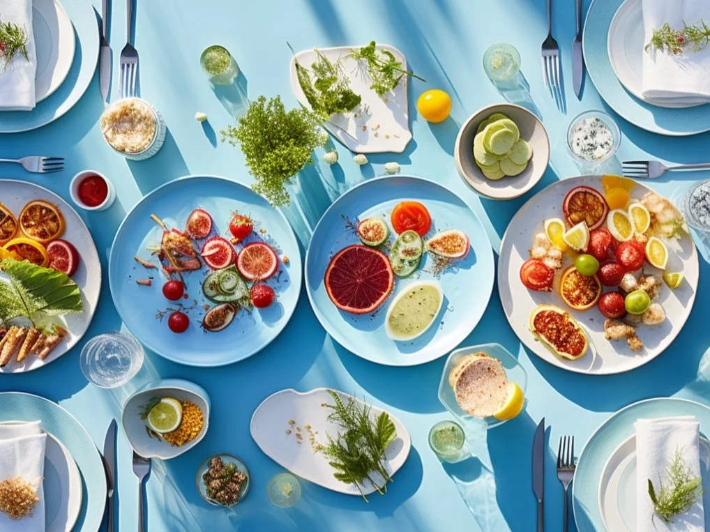
2. Cool Blues and Greens: Calm and Controlled Eating
In contrast to the fiery reds and yellows, cool colors like blue and green have the opposite effect on our appetite. Research suggests that these colors can help slow down eating and reduce overall food consumption. So, if you're trying to watch your portion sizes, consider using blue or green tableware to encourage mindful eating.
3. Warm Neutrals: Fine Dining Elegance
Fine-dining establishments often opt for neutral color schemes, such as soft beige and muted gray. These colors convey sophistication and elegance, creating an environment conducive to leisurely dining. When diners feel relaxed and comfortable, they're more likely to savor their food, enhancing the overall dining experience.
4. The Power of Contrasts
Recent studies have also explored the role of color contrasts in influencing appetite. For instance, a plate with a high contrast between the food and the plate color can make the portion appear more substantial, potentially leading to reduced consumption. On the other hand, low-contrast settings may encourage diners to eat more.
The power of color to influence our appetite is a fascinating aspect of the dining experience. Recent studies have shown that the colors surrounding us during meals can impact our eating behaviors, from stimulating our appetite to encouraging mindful eating. As we become more aware of the role that color plays in our dining choices, both restaurants and individuals can harness this knowledge to create dining environments that enhance our enjoyment of food and promote healthier eating habits. So, the next time you sit down for a meal, take a moment to consider the colors around you – they may be shaping your appetite more than you realize!